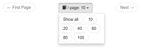
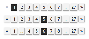
I made a list of features that a good data pager should have, implemented them in my search engine and made many screenshots of pagers in other web applications.
When implementing my self-made search engine phinde, I needed a way to split the search results onto multiple pages.
At first I used the standard sliding pager provided by PEAR's HTML_Pager but found it to be lacking usability.
States of a standard sliding pager
Let's look at a standard sliding pager that is configured to show data on 5 page numbers of a total of 9:
FirstPrev123...NextLast
FirstPrev1234...NextLast
FirstPrev12345...NextLast
FirstPrev...23456...NextLast
FirstPrev...34567...NextLast
FirstPrev...45678...NextLast
FirstPrev...56789NextLast
FirstPrev...6789NextLast
FirstPrev...789NextLast
This is not ideal.
Definition of "good"
To me, a good pager must be based on the sliding pager and have the following additional features:
-
Prev and Next links need to be on the outside because they are used most.
Many standard pagers have First and Last links outside.
-
Prev and Next need to be big so they are easier to hit.
Too many pagers I've seen use < and > that are not easy to click.
-
No duplication.
A standard sliding pager on page 1 starts with FirstPrev12, in which First and 1 do the same.
When following rule #1, they are next to each other: PrevFirst12. This means the pager "phase" that most users see is inefficient because it contains buttons with same functionality.
It's better to ditch the First and Last buttons altogether, but always show buttons for page numbers 1 and the last number.
-
Only show "..." when more than one page is hidden.
I've often seen the following pager state: 12...45. The 3 should be shown instead of the dots because it takes the same space.
-
The position of the Next button should be stable across pages.
I want to be able to click on the first page on Next, use PageDown on page 2 and click the mouse again without moving to get to page 3. That's very handy for quickly evaluating the results of many pages.
States of the good pager
The good pager looks like this, also with 5 pages being shown of 9:
Prev123...9Next
Prev1234...9Next
Prev12345...9Next
Prev123456...9Next
Prev123456789Next
Prev1...456789Next
Prev1...56789Next
Prev1...6789Next
Prev1...789Next
This is implemented in phinde. Have a look at search.cweiske.de/?q=php&page=7.
I'm showing the first and last two pages there, but I'm not sure yet if that's better than showing only one.

Other pagers
A collection of pagers in other web applications.
CircleCI

dockerui

GitHub

GitLab

Heise online

JIRA

MediaGoblin

Piwik

Postfixadmin

Stackoverflow

Woltlab Burning Board


